
Climate alarmists have found an even more brilliant solution to the ‘problem’ of the satellite data which show there has been no global warming for nearly 19 years.
A couple of months ago, you’ll recall, they merely claimed that the satellite data were ‘lying’.
But now they’ve gone a step further. A helpful scientist sympathetic to their cause has gone and tortured the raw satellite data sets so that they now tell the version of reality the climate alarmist establishment prefers.
Here’s the graph (see below right) that shows the change:
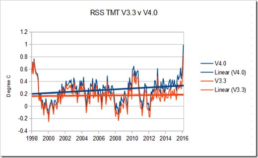
You can see clearly how what was a flat trend now becomes a warming trend. Just like with the heavily doctored land-based temperature data sets. How on earth did this happen?
Well, it seems that Carl Mears the chief scientist at Remote Sensing Systems (RSS) in Santa Barbara, CA – one of the two outfits that deals in satellite temperature data – has been feeling somewhat excluded from the climate alarmist club. In order to show he’s on the right side, he has made some helpful adjustments.
Here’s how he describes it on his blog.
Recently, a number of articles in the mainstream press have pointed out that there appears to have been little or no change in globally averaged temperature over the last two decades. Because of this, we are getting a lot of questions along the lines of “I saw this plot on a denialist web site. Is this really your data?” While some of these reports have “cherry-picked” their end points to make their evidence seem even stronger, there is not much doubt that the rate of warming since the late 1990’s is less than that predicted by most of the IPCC AR5 simulations of historical climate. This can be seen in the RSS data, as well as most other temperature datasets. For example, the figure below is a plot of the temperature anomaly (departure from normal) of the lower troposphere over the past 35 years from the RSS “Temperature Lower Troposphere” (TLT) dataset. For this plot we have averaged over almost the entire globe, from 80S to 80N, and used the entire TLT dataset, starting from 1979. (The denialists really like to fit trends starting in 1997, so that the huge 1997-98 ENSO event is at the start of their time series, resulting in a linear fit with the smallest possible slope.)
That term “denialist” is the giveaway. Not that the kind of language you’d ever find being used by a scientist who has ‘no wishes, no affections, a mere heart of stone’, is it?
Naturally the adjustments have got the usual suspects in the alarmist camp very big in their trousers.
New version of RSS about to be released – the end of the satellite 'pause'? https://t.co/OVWLLoHNF8
— Gavin Schmidt (@ClimateOfGavin) March 2, 2016
But the people who run the other satellite temperature data set – Roy Spencer and John Christy at University of Huntsville, Alabama (UAH) are not so impressed.
Mears’s paper was so threadbare, we learn from Watts Up With That? that it was rejected outright by the Journal of Geophysical Research. So Mears had to find a more sympathetic journal to publish it – one, presumably, that promised it wouldn’t submit it first to unhelpful peer-review by either of the greatest experts in the field Roy Spencer or John Christy.
Funny that.
COMMENTS
Please let us know if you're having issues with commenting.