
The climate change goalposts certainly have moved a lot over the past few years!
Gone are all the models predicting catastrophic man-made ecological catastrophe. The alarmists are down to fiddling with spreadsheets in a last-ditch effort to make it look vaguely plausible that a very modest warming trend might be happening, rather than the 18 years of climate stability all previous measurements have revealed.
Climate change alarmists have been going nuts trying to explain the pause, concocting fanciful theories about the deep oceans swallowing all the warming their computer models so confidently predicted. This was always a curious line of argument, because it amounts to asserting that natural systems are vastly more effective at regulating planetary temperatures than the alarmists predicted… which does mortal injury to their core contention that human industry must be beaten into the dirt to save the Earth. Also, it makes all those hysterical “settled science!” cries look ridiculous. The science wasn’t “settled” at all, if the alarmists were so comprehensively wrong about something as important as the planet’s ability to regulate its climate.
But why fret over explaining the pause you didn’t see coming, if you can just fiddle with a few spreadsheets and make it disappear? That’s what the authors of a new paper published in Science magazine did. They got rid of some data sets they didn’t like, added a few degrees here and there, and presto – the climate change pause is gone, replaced by the possibility of a very gentle warming trend that bears no resemblance whatsoever to the doomsday predictions of the Eighties and Nineties, which led to so many billions of dollars in spending.
I strongly recommend against using such analytical tools to make your financial statements balance, or you’ll end up having words with the IRS.
The paper is from the National Climate Data Center, a division of NOAA. S. Fred Singer, professor emeritus at the University of Virginia and a Heartland Institute Senior Fellow, found the timing of this publication a bit convenient over at the American Thinker:
Of course, NCDC-NOAA and Science may end up with egg on their collective faces. It does look a little suspicious that NCDC arrived at this earth-shaking “discovery” after all these years, after “massaging” its own weather-station data, just before the big policy conference in December in Paris that is supposed to slow the rise of CO2 from the burning of energy fuels, coal, oil, and gas.
Singer predicts sparks will fly between NCDC and other analysts, noting that many climate change true believers who had every reason in the world to deny the existence of the pause have accepted its existence over the years:
There are at least two rival data centers that may dispute the NCDC analysis:
the Hadley Centre in England and the NASA-Goddard Institute for Space Studies (GISS). In fact, Hadley’s partner, the Climate Research Unit at the University of East Anglia, was the first to announce, on the BBC, the existence of a pause in global warming.Then there are also dozens of scientists who have published research papers, purporting to provide an explanation for the reported pause. Yours truly turns out to be amongst these. They will all be mightily disappointed if their intellectual efforts turn out to be for naught.
But hold on. NCDC may turn out to be quite wrong. Not surprisingly, they used the surface temperature record, with its well-known problems. Not only that, but a look at the detailed NCDC evidence shows that much depends on polar temperatures — which are mostly guessed at, for lack of good observations. If one uses the (truly global) satellite data, analyzed either by UAH or by RSS, the pause is still there, starting around 2003.
This gets to the heart of the uncertainty factor, which man-made climate change skeptics and believers alike should be equally willing to respect. The Earth’s climate systems are enormously complex, and they are influenced by equally complex factors from beyond the system, notably including the Sun.
The confident declarations of climate change alarmists are rarely accompanied by the appropriate disclaimer that merely measuring the planetary climate in recent high-tech years is a difficult task, let alone confidently asserting what temperature readings were like in the very recent past, before we had the tools to compile the sort of data we have today. On the scale of planetary meteorology, even crude thermometers just haven’t been around that long, let alone satellites and extensive ground stations. How can we say with confidence there is a pronounced, dangerous, man-made warming trend when we don’t have accurate data from more than a few decades ago for comparison purposes?
The margin for error in climate analysis means most of the core data should be reported as probabilities, not certitudes. For example, the last time the alarmists tried to gin up some headlines, they howled about 2014 being the “hottest year on record,” without noting that there was only about a 30 percent chance that was true, and the degree of “hotness” would be wafer-thin even if the 30 percent panned out.
However well the NCDC analysis holds up to scrutiny, we should be done with that “science is settled” talking point forever, shouldn’t we? It turns out not even the basic data was settled, and if this new paper is correct, the supposedly infallible high priests of global warming have been making a gigantic error for decades…
Reasons for skepticism of the new report have already been advanced. Dr. Benny Peiser at the Global Warming Policy Forum sternly denounced it as “a highly speculative and slight paper that produces a statistically marginal result by cherry-picking time intervals, resulting in a global temperature graph that is at odds with all other surface temperature datasets, as well as those compiled via satellite.”
Some of Peiser’s criticisms fall in line with the uncertainty principle mentioned above. For example, “Even with the 11 changes to their SST [sea surface temperature] database and the problem of start and end dates the authors admit that the statistical significance of their results is only significant at the 0.10 level, and in some cases not even that.”
He finds it significant (and “unwise”) that the data revisions performed by the NCDC begin during periods when strong natural forces were distorting temperature measurements (i.e. the notorious “El Nino” we used to hear so much about in the late Nineties), and downright odd that the heaviest alterations to temperature data occur in later years, when measuring equipment became more technologically sophisticated and pervasive. For instance, data from the Argo array, which Peiser describes as “our best coherent data set on ocean temperatures,” is completely discarded.
Frankly, this all sounds a lot like the infamous fake “hockey stick” graph that kicked off so much global warming hysteria, which was manufactured by conveniently changing methods of estimating and measuring temperature at various points in history, and simply disregarding data that didn’t make it look like the Earth began warming dramatically in accordance with the ramping up of human industry.
“This is a highly speculative and slight paper that produces a statistically marginal result by cherry-picking time intervals, resulting in a global temperature graph that is at odds with those produced by the UK Met Office and NASA,” Peiser concludes. “Caution and suitable caveats should be used in using this paper as evidence that the global annual average surface temperature ‘hiatus’ of the past 18 years has been explained.”
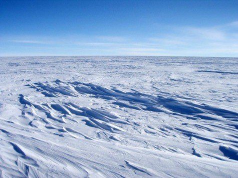
I don’t know, Dr. Peiser – caution and suitable caveats seem like an awful lot to ask from politicized scientists and sensationalist media these days. Even if we abandon that caution and take this new report at face value, I don’t see anything like the apocalypse that was supposed to be in progress, and that sea ice just keeps getting bigger and thicker, exactly the way it wasn’t supposed to. If we’ve got the climate change ogre flat on his back, and we have to hold a data mirror under his nose to see if he’s still breathing, we’re having a very different argument than the one ignorant politicians keep telling us is over.
COMMENTS
Please let us know if you're having issues with commenting.