Meet the new Browns helmet logo. Same as the old Browns helmet logo.
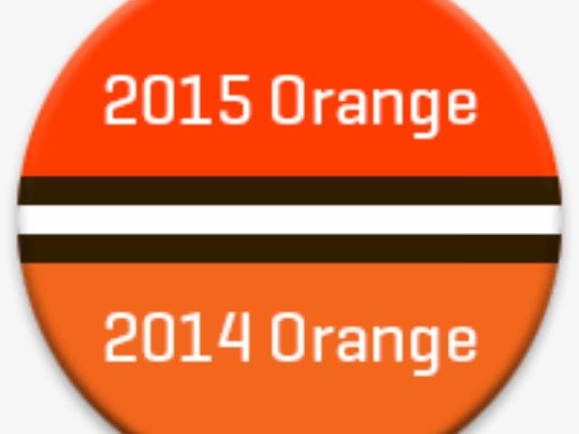
The Cleveland Browns updated their iconic orange helmets and little-seen dawg pound logo on Tuesday. Those lacking a discerning eye might not recognize the difference. The “dawg” appears to scowl a little more and the slightly burnt orange helmets now look bright orange. The team threatens to reveal new uniforms in April.
At least the meddlers didn’t smack a logo onto the blank helmet that sets Cleveland apart from 31 other NFL franchises. The Jedi Mind Trick, which seeks to distract Cleveland’s loyal fanbase from the fact that its quarterback throws back beers more adeptly than he throws forward balls, the prospect of losing draft picks because its GM texts like a 7th-grade girl, and the absence of a playoff victory since Boyz 2 Men reigned on the Billboard Hot 100 and the original Dumb and Dumber outsold all else at the box office. Oh, yeah, they also fired Bill Belichick and spent first-round picks on Tim Couch, Brady Quinn, and Brandon Weeden since then.
“Our updated helmet logo is reflective of today’s modern Cleveland,” the team announces in typical corporate nonsense fashion, “the design honors the past while evolving into the future. The iconic brown and white stripes stand tall over the orange helmet—a new orange color that matches the passion of the Dawg Pound. The new brown facemask represents the strength and toughness of Cleveland.”
What does any of that even mean? It certainly isn’t very Cleveland. Madison Avenue? Sure. But 105th and Euclid? C’mon.


COMMENTS
Please let us know if you're having issues with commenting.