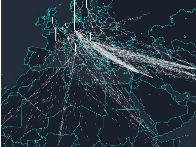
An interactive map shows the journeys of over a million migrants who have made their way across Europe from Africa and the Middle East over the past three years.
The map, created by Finnish company Lucify, uses monthly figures from the United Nations High Commission for Refugees to show the scale of the movement. Each dot represents 25 people, or one bus load, and by hovering over a country you can see how many migrants it has taken, or in the case of African and Middle Eastern countries, how many they have lost.
Some data for the United Kingdom may be missing, but map shows particularly how popular Germany has been as a destination.
Check it out below:

COMMENTS
Please let us know if you're having issues with commenting.